Responsive image: suitable files for mobile and desktop
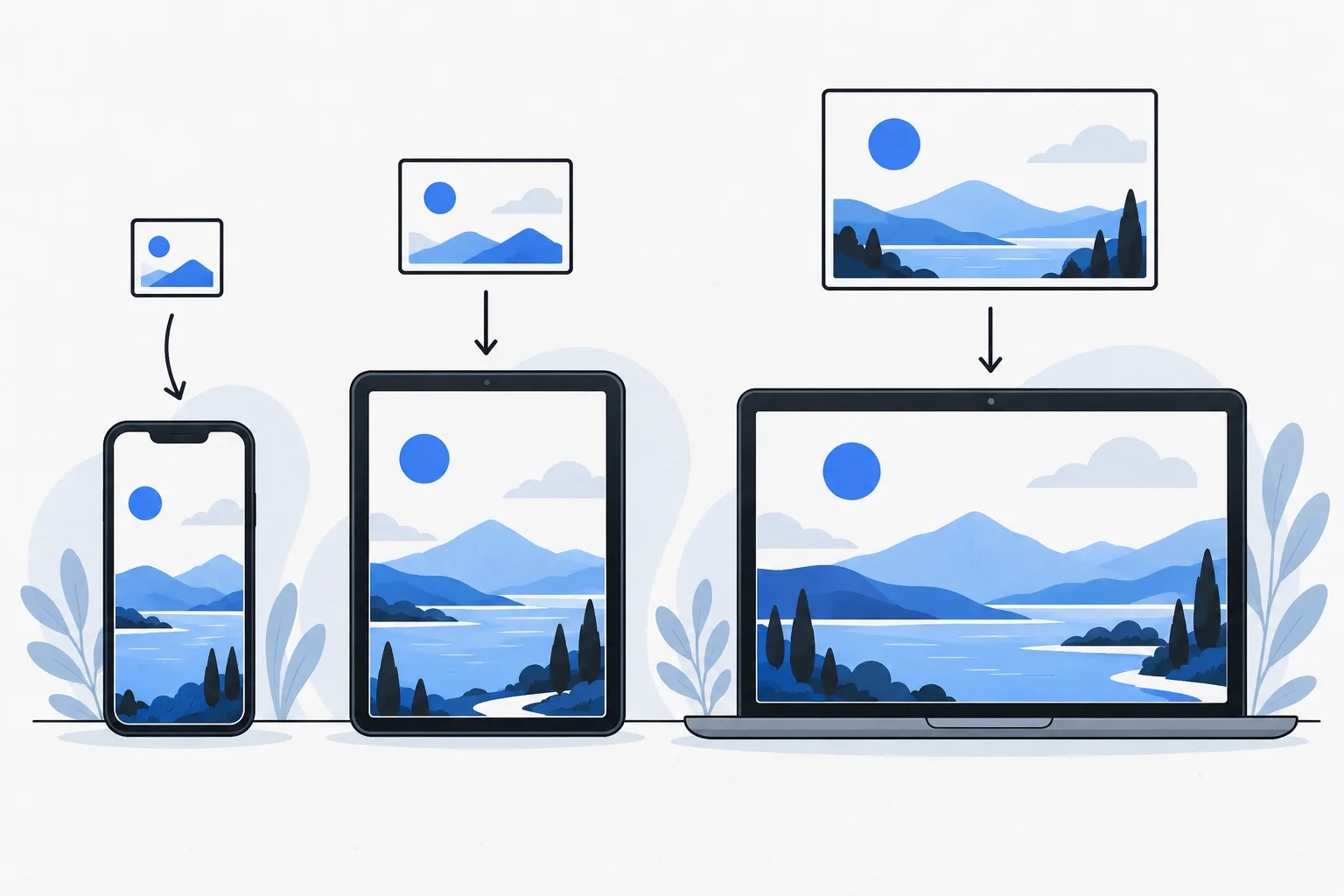
A responsive image lets the browser select an appropriate version based on screen, display size and pixel density. It involves more than shrinking a large file with CSS. Cropping can also change when needed to keep important information understandable on smaller screens.
Also known as: srcset · responsive image delivery
At a glance
- Displayed dimensions and downloaded file size are separate concerns.
- Srcset and sizes help browsers choose among suitable variants.
- Mobile cropping must preserve the image’s important information.
On this page
Why is drawing the image smaller insufficient?
A 3,000-pixel photo can appear in a 360-pixel area while the browser still downloads the original. Smaller visual dimensions do not automatically reduce transferred data.
Responsive delivery offers multiple candidates. MDN explains both resolution switching and changing crops. 1
Alongside mobile-first indexing, this matters for real mobile use. Preserve meaning while adapting delivery to the device.
What do srcset and sizes do?
srcset lists candidate files and their widths. sizes describes the expected display width. The browser uses these and its environment to select a resource.
<img
  src="workshop-800.webp"
  srcset="workshop-480.webp 480w, workshop-800.webp 800w, workshop-1200.webp 1200w"
  sizes="(max-width: 640px) 100vw, 800px"
  width="1200"
  height="800"
  alt="Making a wooden table on a workshop bench">
Adapt the example to the real layout. Overstating display size can cause unnecessarily large downloads. Markup and CSS work together.
When is another crop needed?
A wide photograph can become too small to communicate its subject on mobile. Art direction changes the composition, for example through picture, rather than merely selecting fewer pixels. 1
Do not crop away necessary information from a technical diagram just to improve composition. The reader's search intent includes the visual answer they need.
Example: a carpenter's portfolio
Imagine a full-kitchen photograph showing layout well on desktop but hiding small handles and worktop details on mobile. Separate the overall view from craftsmanship detail.
Provide several resolutions of the overview and individual detail photographs in relevant sections. Visitors avoid one enormous download without losing important evidence. Image compression can reduce each variant further. 2
Image handling is also editorial: what visual information belongs where, and at what detail?
What else remains important?
Alt text conveys meaning or function to people who cannot see the image. Responsive delivery does not replace it. Google's image guidance also considers surrounding content and descriptions. 3
Explicit aspect ratios help reserve stable space. Check loading priority for an LCP image; resolution is only one part of rendering performance.
How do you verify selection?
Inspect actual requested files at different viewport sizes and compare their display quality. A small-screen screenshot alone does not prove a smaller download.
The SEO objective is appropriate quality without unnecessary data, not the maximum number of variants. Choose variants for actual layouts and uses.