What is image compression?
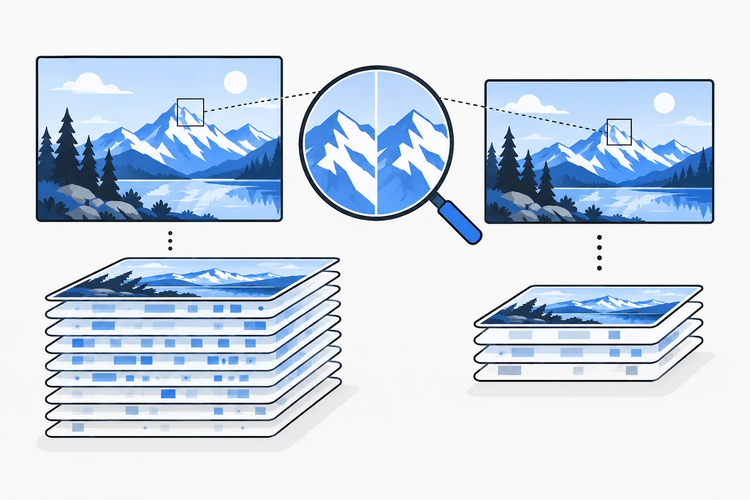
Image compression reduces the data needed to store and transfer an image, either losslessly or by discarding some visual information, while aiming to preserve the quality required for its purpose.
Also known as: image compression · image file compression
At a glance
- File size, pixel dimensions and displayed size are three different measurements.
- The appropriate format and compression level depend on the image content.
- A smaller file is useful only if the important information remains clear.
On this page
What does compression reduce?
An image can remain 1,200 pixels wide while occupying different numbers of bytes depending on how it is encoded. Compression changes how efficiently the visual information is represented.
Resizing is a different operation: it changes the pixel dimensions. Making an image smaller with CSS may change only its displayed size while the browser still downloads the original large file. Effective image delivery considers all three measurements.
What is the difference between lossless and lossy?
Lossless compression allows the original image data to be recovered. Lossy compression reduces size by discarding some detail. A suitable setting may produce little noticeable change at the intended viewing size; excessive compression can create blur, noise or damaged gradients.
Photographs, logos, screenshots and diagrams with small labels have different sensitivities. Applying one quality percentage to every file is not a complete optimization process.
Formats such as WebP or AVIF can provide efficient results, but inspect the actual output and the support needed for the intended use. The format name alone does not prove the best result.
How do responsive images help?
A responsive image offers the browser appropriate alternatives for different display conditions. Each version can also be compressed. A small screen need not receive the largest available file.
However, a tiny file is not a success if a chart’s labels become unreadable. The solution might require another composition, a simpler diagram or an accompanying text explanation.
Let the image’s purpose guide the choice. Is it decorative, showing a product detail or explaining a complex relationship?
An example: a renovation photograph
Imagine a tiler publishing a bathroom-renovation photograph. The original phone image is much larger than its displayed article width.
The editor creates a suitably sized version and compares several encodings. The smallest file blurs the grout lines and surface details that demonstrate the work. A slightly larger version preserves those details and is the better publishing choice.
This is a hypothetical production example. It does not establish a measured load-time or ranking improvement. The result should be checked at the actual display size, especially on mobile.
Will compression fix a slow main image?
It can help when transfer size is a bottleneck. If the main image is discovered only after delayed script execution, another problem also needs attention. LCP depends on more than file size.
Likewise, lazy loading can reduce unnecessary downloads farther down a page, but delaying an immediately visible main image can work against the goal.
How can the process stay maintainable?
Keep a high-quality original and generate publishing versions from it. Repeatedly saving an already degraded image can compound quality loss and limit future resizing options.
Evaluate the result as part of image SEO: does the image arrive efficiently and still communicate the reason it was included? The smallest possible file is not automatically the most useful one.