CLS: measure unexpected layout shifts
CLS, or Cumulative Layout Shift, is a unitless measure of unexpected visual layout shifts on a webpage. It reflects how already visible elements move when, for example, an image or banner loads late. The current calculation uses the largest qualifying cluster of layout-shift events.
Also known as: Cumulative Layout Shift
At a glance
- CLS measures visual stability rather than loading time.
- The upper boundary of the good range is 0.1.
- Reserving space for images and dynamic elements can reduce unexpected jumps.
On this page
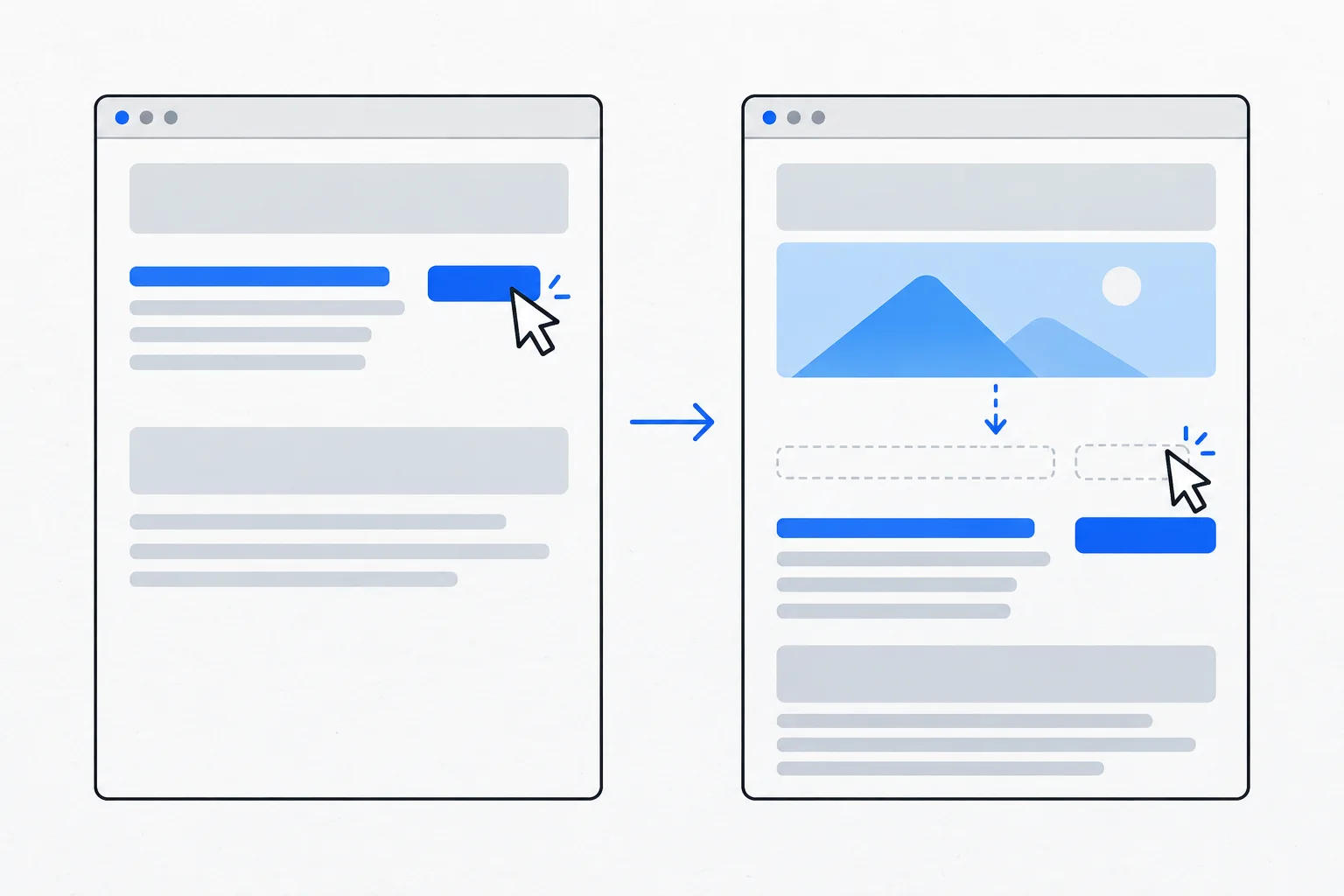
What experience does CLS describe?
A reader is following a paragraph when an image appears above it and pushes the text downward. Or a button moves just as someone tries to tap it. These unexpected layout changes disrupt reading and interaction.
The CLS documentation describes scoring the largest qualifying cluster of shifts, rather than simply adding every movement over the page's entire lifetime.
How is it different from scrolling or animation?
Not every movement is undesirable. People intentionally scroll, and opening a menu can change the display in an expected way. CLS applies specific measurement rules to unexpected layout movement.
It is not measured in seconds. The affected visual area and movement distance contribute to the score. A small icon moving slightly and a large reading area shifting substantially do not necessarily have the same effect.
Within Core Web Vitals, good CLS is 0.1 or lower. Field assessment uses the appropriate percentile of visits rather than one occasion when a developer notices no jump.
What commonly causes shifts?
Images without reserved dimensions, late-inserted notices, changing embed sizes and font substitutions can all contribute. The browser initially allocates a different amount of space from what the final element needs.
A responsive image can provide suitable files for different screens, but its aspect ratio and reserved space still need attention. Lazy loading is not a reason to leave no space until an image arrives.
Browser-level lazy-loading guidance describes supplying width and height. Deferred loading and stable layout are compatible.
Example: a mobile restaurant menu
Imagine a menu where dish names appear quickly but photographs arrive later, repeatedly pushing subsequent rows down. The guest loses track of the price they were reading.
A developer reserves space matching each image's aspect ratio. The photograph can load later without displacing the rows to the same extent. The team then tests on a slower connection because a warm browser cache previously hid the issue.
This fictional example does not require a fixed pixel size on every device. Responsive sizing can work with a known aspect ratio.
How does editorial work affect stability?
A large promotion inserted above content after reading has begun can cause a shift. SEO therefore includes the practical presentation of content, not just text fields.
Alt text communicates image meaning but does not reserve layout space. Captions, sizing and loading behavior are separate responsibilities that may involve editors and developers.
What should be checked afterward?
Observe more than the first second. Scroll, interact and wait for later content. Ads, embeds and notices may arrive at different times in real visits.
A better CLS result establishes improved stability within the measured scope. It does not establish correct information or a ranking gain. Its immediate value is reducing lost reading position and accidental interaction with moving targets.