Call to action: offer a clear, relevant next step
A call to action, or CTA, invites the reader to take a specific next step. It might request a quote, book an appointment or open a related guide. The invitation, its click and the eventual business outcome are separate events.
Also known as: CTA · call to action
At a glance
- A useful CTA explains the next step and fits the reader’s situation.
- A click is not automatically an inquiry, purchase or completed conversion.
- The wording’s promise should match what the destination actually does.
On this page
What makes an invitation a CTA?
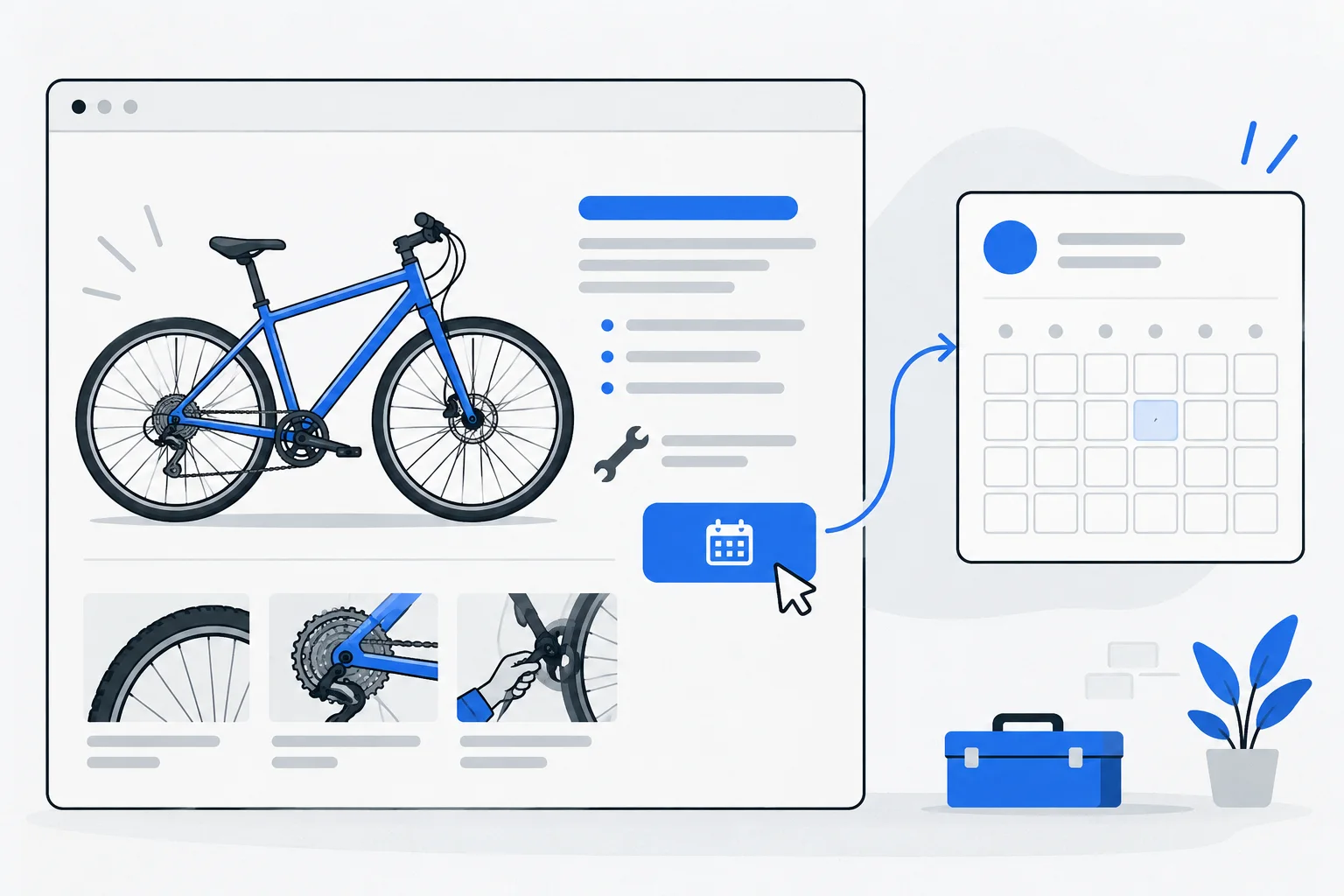
A CTA is more than a colored button. Its essential feature is the action offered: what can a reader do with the information just learned? “Request a quote” invites contact, while “View the size guide” supports further research.
HubSpot's documentation describes forms such as buttons and banners, but the concept is not limited to a tool. A good invitation communicates a clear purpose without forcing people to infer it from appearance.
How does it relate to search intent?
Someone learning which service they need may welcome a different step from someone ready to request a price. Search intent helps choose the action. A basic definition can naturally lead to an example or guide before a lengthy purchasing process.
Informational pages can still offer a service. Connect the reader's question with genuinely available help. If the article explains a choice, the offer should clarify what the business can help accomplish after that choice.
What should the button say?
Name the next action and, where useful, its object. “Continue” often says less than “Choose an appointment” or “View the packages.” The destination must fulfill the promise. A button advertising a free sample should not unexpectedly lead to payment.
For accessible use, keep the visible label, accessible name and behavior aligned. If the next step is a form, clear field labels continue the same clarity. A confusing destination can undermine an excellent initial invitation.
Example: an air-conditioner cleaning inquiry
Imagine a service article explaining signs that an air conditioner may need cleaning. A relevant CTA says “Request an air-conditioner cleaning quote.” The destination explains which information is needed and when a response can be expected.
The reader first understands the problem, then finds matching help. Sending that button to a generic homepage listing unrelated services would weaken the connection.
This fictional example shows that effectiveness begins with agreement between the promised and actual next step, not louder wording.
How does a CTA differ from a conversion?
A conversion is a defined important action. A report may treat a button click as one, but a completed inquiry or payment often matters more commercially. Opening a form and abandoning it is not a received lead.
Where measurement permits, distinguish the invitation's appearance, its click and successful completion. The destination page is part of the journey. This separation can help distinguish unclear copy from an unusable form.
How should CTAs fit the content library?
Content strategy connects questions with the help the business offers. Every page need not repeat identical wording. A contextual internal link can support learning while a prominent CTA emphasizes the most relevant action.
Evaluate more than click quantity. Misleading promises can generate clicks and disappointment together. A useful CTA makes an available action easy for the appropriate reader to understand.
For lead generation, the next step should match the reader’s readiness. A smaller micro-conversion, such as opening a relevant guide, may be useful, but it should not be reported as a completed sale.